
TL;DR:
- Automated dashboards enable real-time business insights by continuously refreshing data from live sources without manual effort. Successful implementation requires clean data, layered architecture, and role-based governance to ensure accuracy and performance. AI and low-code tools accelerate prototyping and deployment, especially in regulated and Arabic-language contexts like Saudi Arabia and UAE.
Automated dashboards are defined as self-refreshing data visualization interfaces that pull from live data sources, apply predefined logic, and present updated metrics without manual intervention. For business analysts and data professionals in Saudi Arabia, UAE, and Egypt, this capability transforms reporting from a weekly chore into a continuous, real-time intelligence feed. Tools like Microsoft Power BI, Tableau, Google Sheets with Apps Script, and AI-powered generators like VibeFactory now make automated dashboard creation accessible without deep engineering resources. The difference between a static report and a live dashboard is the difference between a photograph and a security camera. One tells you what happened. The other tells you what is happening right now.
What prerequisites and tools do you need to create automated dashboards?
The foundation of any reliable automated dashboard is clean, well-structured data. Before you write a single formula or connect a single API, you need to know exactly what data you have, where it lives, and whether it can be trusted. Data audit phases lasting 4 to 6 weeks are standard for mid-sized companies before launching any dashboard initiative. That timeline exists because inconsistencies in source data, mismatched date formats, duplicate records, and missing values all compound once automation begins. A dashboard that refreshes every hour will surface the same errors every hour, at scale.

Your data sources determine your tool options. Common connectors include CRM platforms like Salesforce or Microsoft Dynamics 365, cloud data warehouses like Snowflake and Google BigQuery, and ERP systems like Odoo. Once you know your sources, you can match them to the right dashboard platform.
| Tool | Best for | Automation depth | Coding required |
|---|---|---|---|
| Microsoft Power BI | Enterprise BI with Microsoft stack | High (scheduled refresh, alerts) | Low to medium |
| Tableau | Advanced visual analytics | High (Tableau Server/Cloud) | Low |
| Google Sheets + Apps Script | Lightweight, low-cost dashboards | Medium (scripted refresh) | Medium |
| VibeFactory AI | Rapid prototyping from structured data | High (AI-generated in seconds) | None |
| Low-code platforms (e.g., Cortex) | MENA enterprise, Arabic UI, on-premise | High (workflow + dashboard combined) | None |
The right choice depends on your data volume, your team’s technical profile, and your governance requirements. For organizations in Saudi Arabia and UAE operating under strict data residency rules, on-premise or private-cloud options like Singleclic’s Cortex platform carry a distinct advantage over purely cloud-based tools.
- Confirm data source reliability before connecting any tool
- Identify refresh frequency needs (real-time, hourly, daily)
- Map user roles and access levels before building begins
- Choose tools that match your team’s existing skill set
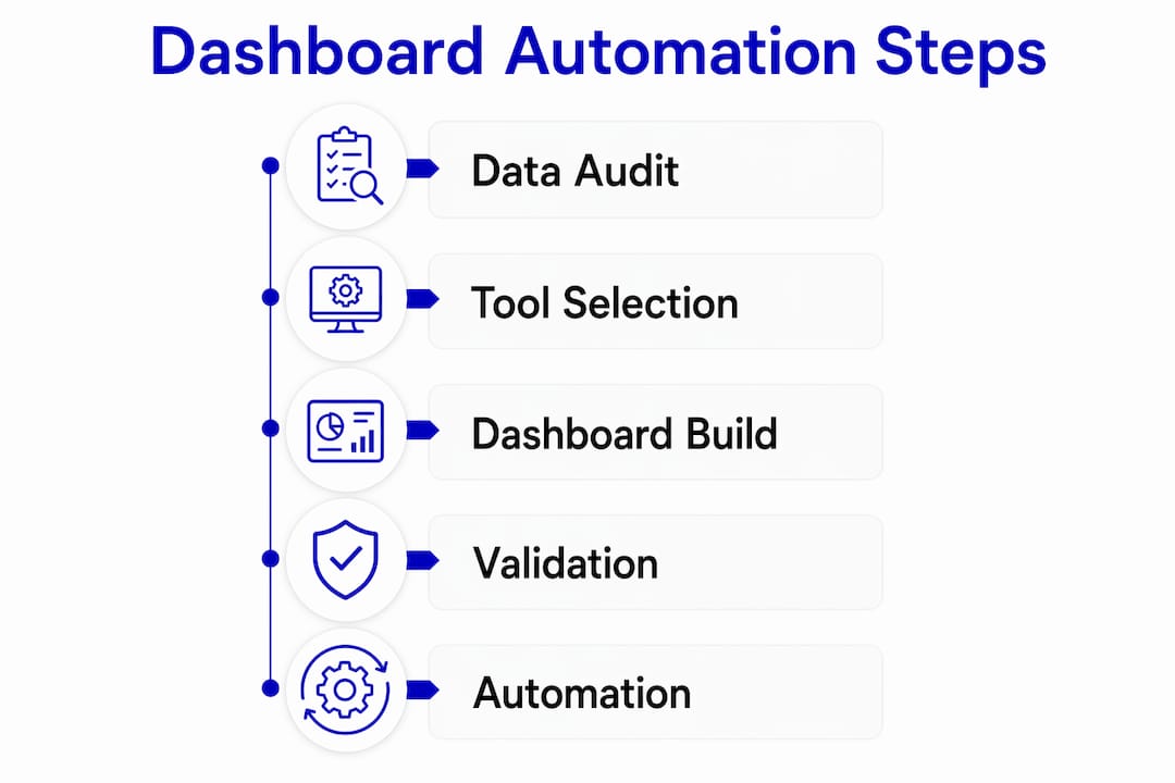
How do you build and automate a dashboard step by step?
Building an automated dashboard follows a four-layer architecture. Each layer has a specific job, and mixing them is the most common source of performance problems and formula corruption.
-
Ingest raw data into a dedicated layer. Whether you use a hidden tab in Google Sheets, a staging table in BigQuery, or a data flow in Power BI, raw data should never appear in your presentation layer. Segregating dashboard architecture into ingestion, transformation, and presentation layers minimizes performance issues and prevents formula errors from cascading. Google Sheets combined with Apps Script, for example, can handle hundreds of thousands of rows when the architecture separates concerns properly.
-
Transform and aggregate data in a calculation layer. This is where you apply business logic: revenue by region, churn rate by cohort, project completion percentage by team. Use SQL queries, Power Query, or AI-assisted parsing tools to produce clean summary tables. The goal is a set of pre-aggregated outputs that the presentation layer simply reads, not recalculates.
-
Build the presentation layer with interactive UI elements. Slicers, dropdown filters, date range selectors, and conditional formatting all belong here. Critical KPIs placed in the top-left corner following an inverted pyramid design maximize clarity and user adoption. Executives scan dashboards the same way they scan a newspaper: top-left first, then right, then down. Design with that behavior in mind.
-
Automate refresh schedules and configure alerts. In Power BI, you set scheduled refresh intervals through the service settings. In Tableau Cloud, you configure extract refresh schedules. In Google Sheets, Apps Script triggers handle timed refreshes. Automated alerts and workflow integrations can reduce decision-making delays by notifying stakeholders the moment a KPI crosses a threshold. These alerts can also create tasks automatically in CRM or project management tools, closing the loop between insight and action.
Pro Tip: Never expose raw data tabs to end users. Lock down ingestion and transformation layers with sheet protection or role-based permissions, and only share the presentation layer. This prevents accidental edits that break your automation logic.
What are common challenges and mistakes when creating automated dashboards?
Most dashboard projects fail not because of technical limitations but because of decisions made before the first chart is drawn.
“A dashboard that shows everything tells you nothing. The most effective automated dashboards are ruthlessly focused on the decisions they are designed to support.” — BI design principle, Domo
The most frequent mistakes fall into five categories:
- Overloading the dashboard with irrelevant metrics. Every additional chart competes for attention. Role-based dashboard templates that customize views for executives, managers, and analysts separately produce higher adoption rates than one-size-fits-all layouts.
- Skipping governance and access controls. Role-based access control and real-time usage tracking are not optional features. Enterprises that deployed AI-powered dashboards without governance protocols faced significant financial and operational losses. Set permissions at the data source level, not just the dashboard level.
- Failing to audit source data before launch. Automating a broken data pipeline produces wrong answers faster. The 4 to 6 week audit process exists specifically to catch inconsistencies before they become automated, recurring errors.
- Ignoring performance architecture. Connecting a presentation layer directly to a raw database table with millions of rows will produce slow, unreliable dashboards. Pre-aggregated summary tables or materialized views solve this at the architecture level.
- Neglecting user training. A technically perfect dashboard with zero adoption delivers zero value. Schedule structured walkthroughs for each user group and document the KPI definitions so everyone interprets metrics consistently.
Which automation techniques and AI integrations can enhance dashboard creation?
AI has changed the speed at which you can prototype and iterate on dashboards. AI-driven dashboard generators can reduce creation time from hours to under 60 seconds when provided with clean, structured data. That speed advantage is most valuable in the prototyping phase, where you need to show stakeholders a working concept before committing to a full build.
The practical workflow looks like this:
- Use an AI generator like VibeFactory to produce a first-draft layout from a sample dataset in under a minute
- Iterate on layout, filters, and KPI selection using natural language prompts
- Export the validated design into a governed BI platform like Power BI or Tableau for production deployment
- Configure automated refresh, role-based access, and alert thresholds in the production environment
Low-code platforms enable business analysts to create and iterate on automated dashboards without writing backend code, which accelerates deployment significantly in fast-moving markets like Saudi Arabia and UAE. Singleclic’s Cortex platform, built specifically for MENA enterprises, combines Arabic UI support, on-premise deployment, and real-time process optimization in a single environment. That combination matters for organizations in banking, healthcare, and government where data cannot leave the premises.
One important boundary: AI should be used for ideation and prototyping, not as a replacement for governed BI platforms when security and metric consistency are at stake. AI-generated dashboards are excellent starting points. They are not production-ready governance frameworks.
How does regional context in Saudi Arabia and UAE shape dashboard adoption?
Digital transformation in Saudi Arabia and UAE is accelerating faster than in most comparable markets, driven by Vision 2030 initiatives, smart city programs, and aggressive enterprise modernization across construction, healthcare, banking, and government sectors. Effective dashboard automation contributes directly to faster, data-driven decision-making and operational agility, which is a measurable competitive advantage in these markets.
Several regional factors shape how you approach automated dashboard creation in this context:
- Data residency and compliance requirements in Saudi Arabia and UAE often mandate on-premise or private-cloud deployments, making tools like Cortex more appropriate than purely SaaS-based platforms for regulated industries.
- Arabic language support is a practical requirement, not a preference, for dashboards used by operations teams and government stakeholders. Most global BI tools offer limited Arabic UI support.
- Data silos across legacy ERP and CRM systems remain a significant integration challenge in regional enterprises. Connecting Odoo, Microsoft Dynamics 365, and custom databases into a single dashboard layer requires deliberate connector architecture.
- Rapid deployment expectations in competitive markets mean that low-code platforms in enterprise transformation deliver measurable time-to-value advantages over traditional development cycles.
Industries like construction, real estate, and healthcare in the region are already using automated dashboards to track project milestones, patient flow metrics, and financial KPIs in real time. The infrastructure is there. The gap is usually in data quality and governance, not in tool availability.
Key takeaways
Automated dashboards deliver real-time business intelligence only when built on clean data, governed architecture, and role-specific design.
| Point | Details |
|---|---|
| Audit data before building | Run a 4 to 6 week data audit to catch inconsistencies before automation amplifies them. |
| Separate architecture layers | Keep ingestion, transformation, and presentation layers distinct to prevent performance failures. |
| Apply governance from day one | Set role-based access controls and usage tracking before any dashboard goes live. |
| Use AI for prototyping, not production | AI generators cut creation time to under 60 seconds but require governed BI platforms for deployment. |
| Design for the user, not the data | Place critical KPIs top-left, limit charts per view, and build role-specific templates for higher adoption. |
What I have learned building dashboards for Middle Eastern enterprises
After working with organizations across Saudi Arabia, UAE, and Egypt, the pattern I see most often is this: teams invest heavily in the dashboard tool and almost nothing in the data layer underneath it. They connect Power BI to a live ERP table, build a beautiful layout, and then spend the next three months explaining why the numbers do not match the finance team’s spreadsheet. The tool was never the problem.
The second pattern is governance treated as an afterthought. I have seen dashboards deployed to 200 users with no access controls, no audit trail, and no defined KPI ownership. When a metric looks wrong, nobody knows who is responsible for fixing it. That is not a technology failure. It is a process failure that technology made visible.
What actually works in this region is a combination of low-code platforms for speed, on-premise deployment for compliance, and a disciplined data governance framework that assigns ownership to every metric before the first chart is built. Cortex, Singleclic’s Arabic-enabled low-code platform, was designed specifically for this environment. It is not a coincidence that the clients who adopt it alongside a structured data audit process see the fastest time-to-value.
AI dashboard tools are genuinely useful for getting stakeholder buy-in early. Show a working prototype in 60 seconds and you will get the feedback you need to build the right thing. But treat that prototype as a conversation starter, not a finished product. The governance layer is what turns a prototype into a business asset.
— Tamer
Build smarter dashboards with Singleclic
Singleclic helps business analysts and data teams across Saudi Arabia, UAE, and Egypt move from disconnected data to live, governed dashboards faster than traditional BI implementations allow. Through ERP and CRM integrations with Odoo and Microsoft Dynamics 365, combined with Cortex, Singleclic’s Arabic-enabled low-code platform for enterprises, your team can design, automate, and deploy dashboards without writing backend code. You can also explore Singleclic’s guide on automating reporting workflows to complement your dashboard strategy.
If your organization is ready to move beyond static reports and build real-time decision intelligence, Singleclic’s consultants are available across KSA, UAE, and Egypt to support your implementation from data audit to go-live.
FAQ
What is an automated dashboard?
An automated dashboard is a data visualization interface that refreshes automatically from connected live data sources, eliminating manual data entry and report generation. It presents current metrics, KPIs, and trends without human intervention.
How long does it take to build an automated dashboard?
Build time ranges from under 60 seconds for AI-generated prototypes using tools like VibeFactory to several weeks for production-grade dashboards that include data auditing, governance setup, and enterprise integration. The data preparation phase alone typically takes 4 to 6 weeks for mid-sized organizations.
What are the best tools for automated dashboard creation?
Microsoft Power BI, Tableau, and Google Sheets with Apps Script are the most widely used tools. For MENA enterprises requiring Arabic UI and on-premise deployment, low-code platforms like Singleclic’s Cortex offer a purpose-built alternative.
How do I keep my automated dashboard accurate?
Accuracy depends on three factors: clean source data validated before connection, a separated transformation layer that applies consistent business logic, and role-based access controls that prevent unauthorized edits to the underlying data structure.
Do I need coding skills to create automated dashboards?
Not necessarily. Low-code platforms and AI dashboard generators allow business analysts to build and automate dashboards without writing code. Tools like Cortex and VibeFactory are specifically designed for non-developer users in enterprise environments.